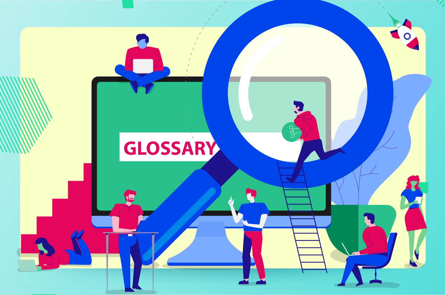
Like all industry sectors, graphic designers have their own lingo and jargon. Some of it dates back to the days of hand drawn artwork, whereas other terms have come about more recently as a result of the digital evolution.
Here at Identity Studio, we’re big advocates of using plain speech with our clients, but we’re all too aware that we occasionally slip into designer speak without even realising it! So we thought it’d be helpful to demystify the terminology for you…
Colours
CMYK – abbreviation for cyan, magenta, yellow and black (key), which are the four process colours used in printing
RGB – abbreviation for red, green and blue, which are the three colours of visual light used to display computer graphics
Spot colours – specially mixed ink using in printing based on the Pantone Matching System
Warm colours – reds, oranges and yellows
Cool colours – blues, greens and many purples
Graphics
Bitmap image – collection of thousand of individual dots (pixels); can be manipulated in software like Photoshop, but if they’re enlarged too much they become jagged or “pixelated”
Vector graphic – made up of points connected along a path (vector); they don’t lose quality when resized, so they’re best for logos and other graphics that will need to be produced on large items, e.g. flags, banners etc.
File formats
EPS – used for scalable vector images, or images that contain both text and graphics
PDF – ideal for exporting documents to share, like design layouts; can be viewed on the free software Adobe Acrobat
GIF – used for small image files with few colours and designs; can be animated
JPEG – one of the leading formats for saving compressed photos from your camera
PNG – used for screen applications like websites and presentations as are RGB only; great for inserting on top of graphical backgrounds because you can have transparent backgrounds (unlike JPGs)
TIFF – used for storing high colour depth images
ZIP – compresses multiple files into a single folder without losing any data
Stock
Both paper and card stock come in different finishes, which affect the appearance and feel of the printed item.
Gloss – often used for full-colour printing as it reflects light off the paper’s surface, but marks easily if handled a lot
Silk – a paper or card with a softer sheen finish
Uncoated – a matt paper that’s absorbent
Gloss laminate – glossy coating applied to the paper’s surface to create a high gloss covering
Matt laminate – a coating applied to the paper’s surface to create an ultra-soft feel
Typefaces
A typeface consists of a series of fonts and a full range of characters, such as numbers, letters and punctuations.
Serif – characters that have a “tail” or serif crossing the ending of a stroke, e.g. Times New Roman
Sans serif – characters without a serif (tail), e.g. Arial or Calibri
Slab serif – block-like fonts with serifs, e.g. Rockwell, Museo
Script – normally italicised, fluid fonts like elegant handwriting
Typography
Bleed – printed image that ‘bleeds’ off the edge of the page instead of having a border around it
Kerning – space between individual letters
Leading (pronounced “led-ding”) – space between lines of text
Negative (or white) space – blank space surrounding text and images
Orphan – first line of a paragraph that appears alone at the bottom of a page, with the remainder on the next page
Widow – single word that carries over from the end of a paragraph to the next column or page
In Part 2, we thought we’d take a look at some specific web design terms. These will help you communicate more effectively with your designer and developer – whether you’re having a new website built or updating an existing one. So watch this space!